In recent years, the evolution of software design has brought forth several new interface philosophies. While many of these changes aim to improve the user experience, some of them simply make tasks more complicated. As a long-time user of various operating systems and software, there are three particular interface features that I absolutely despise. Let me take you through each one and explain why they frustrate me so much.
1. Multi-Level Menus
Multi-level menus are a design philosophy that requires users to navigate through multiple layers of options to find a feature. To access a particular tool or setting, you might first have to open one menu, then another sub-menu, and then another, before finally reaching the option you need.
While this can be somewhat justified in complex software packages like engineering tools or video editors, I find it incredibly irritating in simpler applications. For example, in Windows 11’s file explorer, this kind of multi-level navigation feels completely unnecessary. It adds more clicks to the process, making something simple much more tedious than it needs to be. In previous versions of Windows, accessing features was quicker, with fewer steps. The extra layers in menus feel like a step backward, as they increase the time and effort to get to the same result.
2. Tabs
A trend that has become increasingly pervasive in modern software design is the use of tabs. For many, this started with browsers like Opera, but over time, tabs have made their way into all kinds of software, from email clients to Windows File Explorer.
Years ago, when tabs were first introduced, they were a novel concept. They were primarily used in three key areas: Photoshop, the Miranda instant messaging client, and the Opera browser. Tabs were useful in situations where you had multiple things open and wanted to keep them organized in one window. However, as the use of tabs expanded, especially in browsers, I started to notice the downsides. I don’t tend to have more than five or ten websites open at a time, so I don’t need tabs in my browser. In fact, I much prefer opening separate windows for each task, as it feels more organized and easier to manage.
Now, the tabbed interface is everywhere, even in places it doesn’t belong, like File Explorer and email clients. Many modern browsers are designed in such a way that they no longer support managing separate windows. This shift towards tabs can be frustrating for people like me who just want the flexibility to choose between tabs or separate windows. I would love to see the option to toggle tabs on or off in software, but unfortunately, that option is rarely available these days.
3. Conversation Mode in Email Clients
The third and final feature that irks me is “conversation mode” in email clients. This mode groups replies to emails into a single thread or conversation, showing responses in a tree-like structure. The idea is that it will help users see the full context of an email chain and make it easier to follow discussions.
For some people, this might be a useful feature, but for those of us who manage hundreds of emails daily, conversation mode can be a nightmare. In a corporate setting, I might receive dozens of replies to emails with multiple recipients throughout the day. When all these replies are grouped together into threads, it becomes incredibly easy to miss important emails. A response could be buried deep within a conversation thread, and you might not notice it because it isn’t prominently listed in your inbox.
While I don’t necessarily have an issue with conversation mode in theory, I want the option to turn it off. Unfortunately, most modern email services, from Gmail and Office 365 to desktop clients like Outlook and Thunderbird, have this feature enabled by default. Thankfully, there are ways to turn it off, but it’s buried deep within the settings.
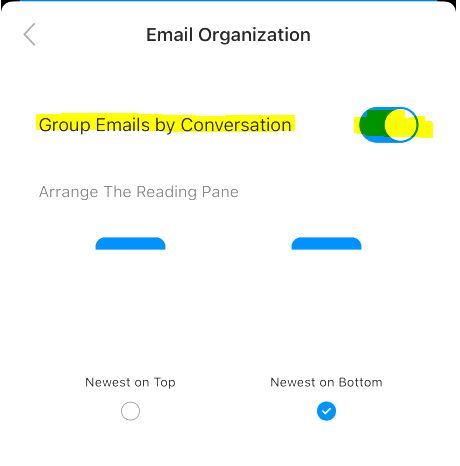
For example, in Microsoft Outlook on an iPhone (using Office 365), you can disable conversation mode by following these steps:
Tap on “Inbox” at the top of the screen.
Scroll to the bottom and tap the gear icon to access settings.
Under “General Settings,” tap on “Email Organization.”
Look for the setting called “Group emails by conversation” and turn it off.
Once disabled, emails will no longer be grouped into threads and will appear as separate entries in your inbox, making it much easier to keep track of important messages.
Conclusion
As software continues to evolve, these interface design choices have become more widespread. While some users may enjoy them, they often complicate what could be a simple, efficient experience. Multi-level menus, tabs, and conversation mode are features that might be great for some, but for me, they are frustrating obstacles to productivity.
It’s important for software developers to remember that while innovation is essential, user choice is equally important. Features like these should come with an option to toggle them on or off, giving users the flexibility to choose the interface that works best for them. If you, like me, find these features annoying, you’re not alone. Let’s hope that future updates and software releases will provide more options for customizing the user experience.